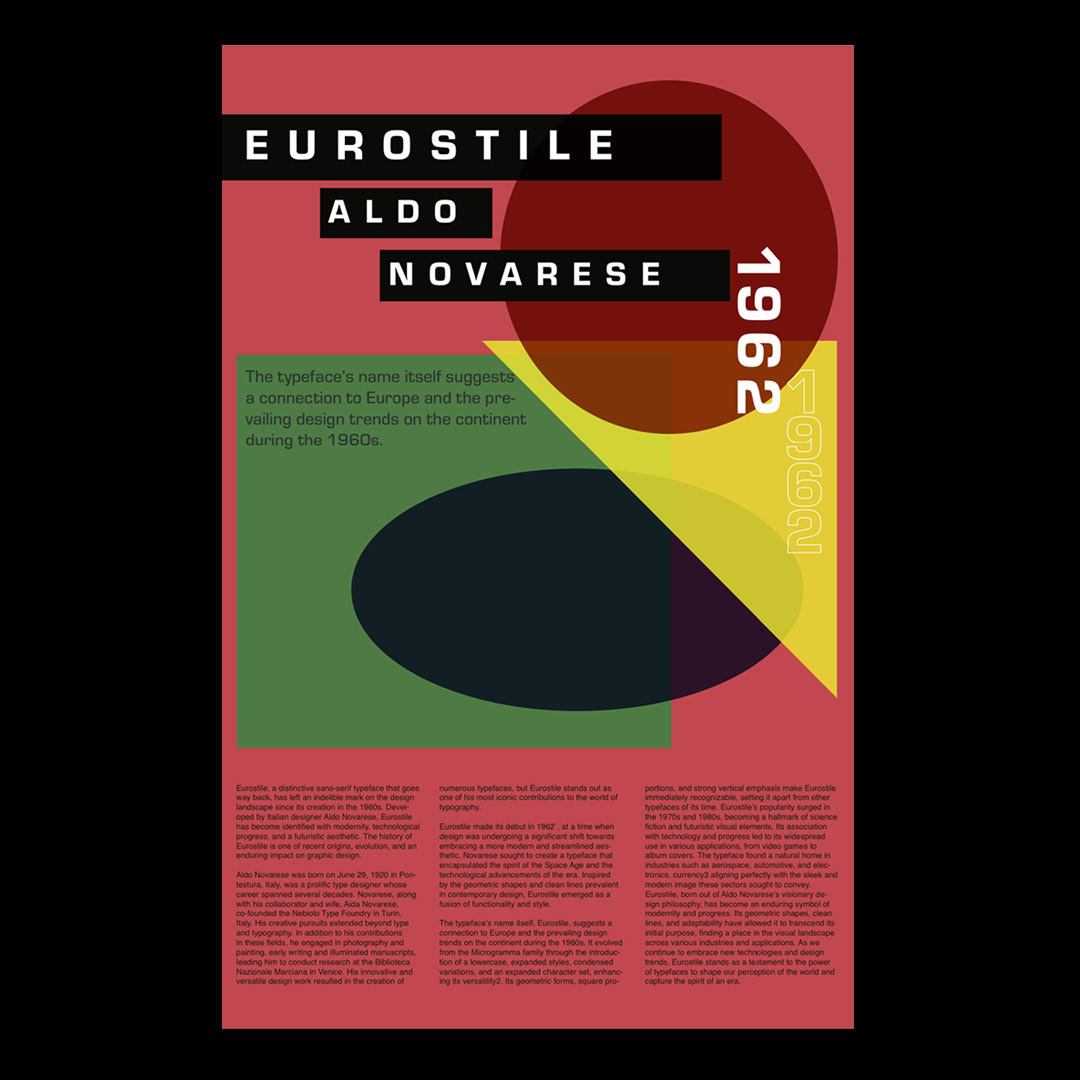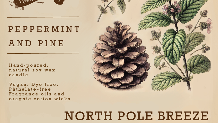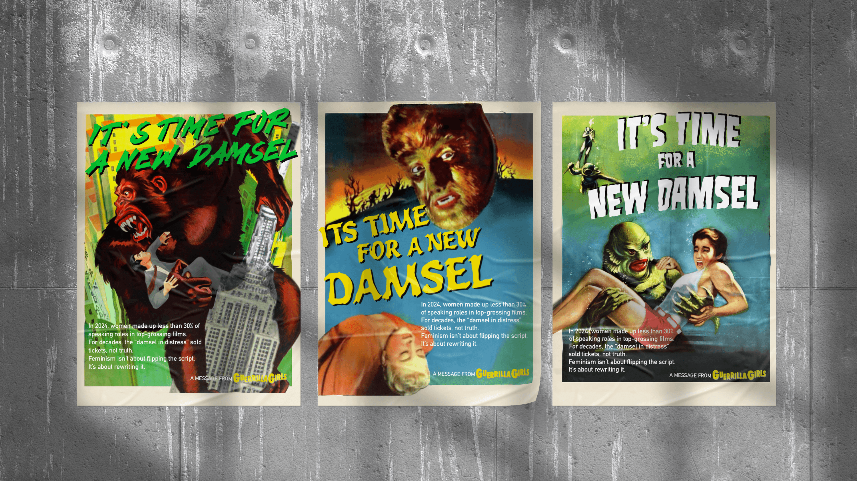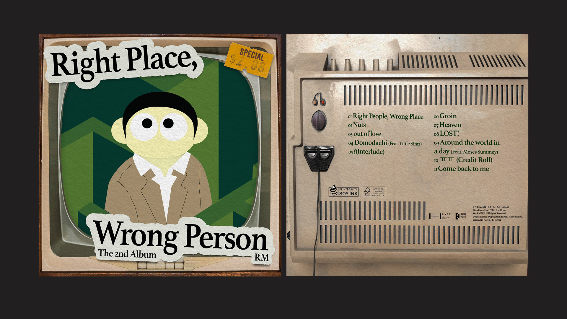
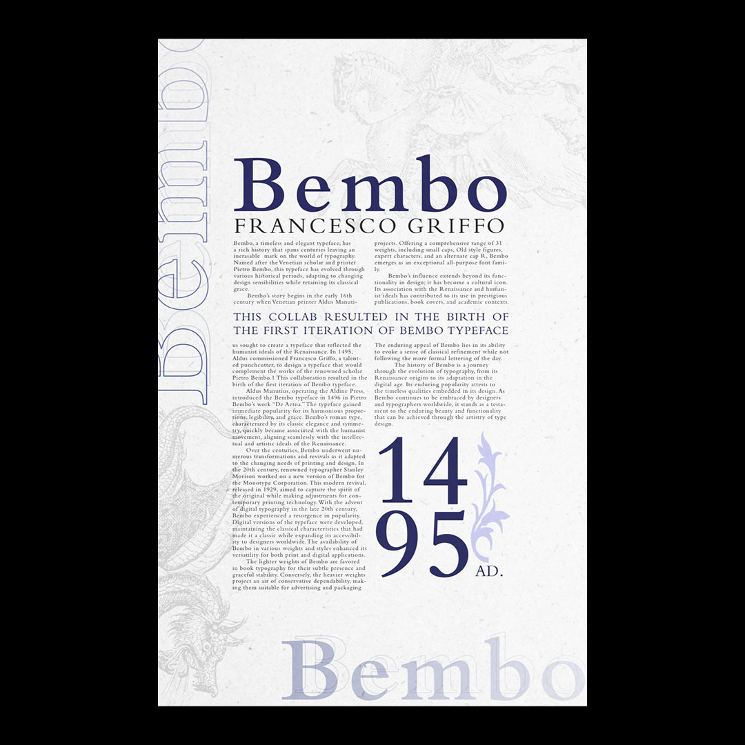
Posters for the fonts Bembo and Eurostile, each work gives a brief history of the typeface as well as a provides visual use for the fonts.
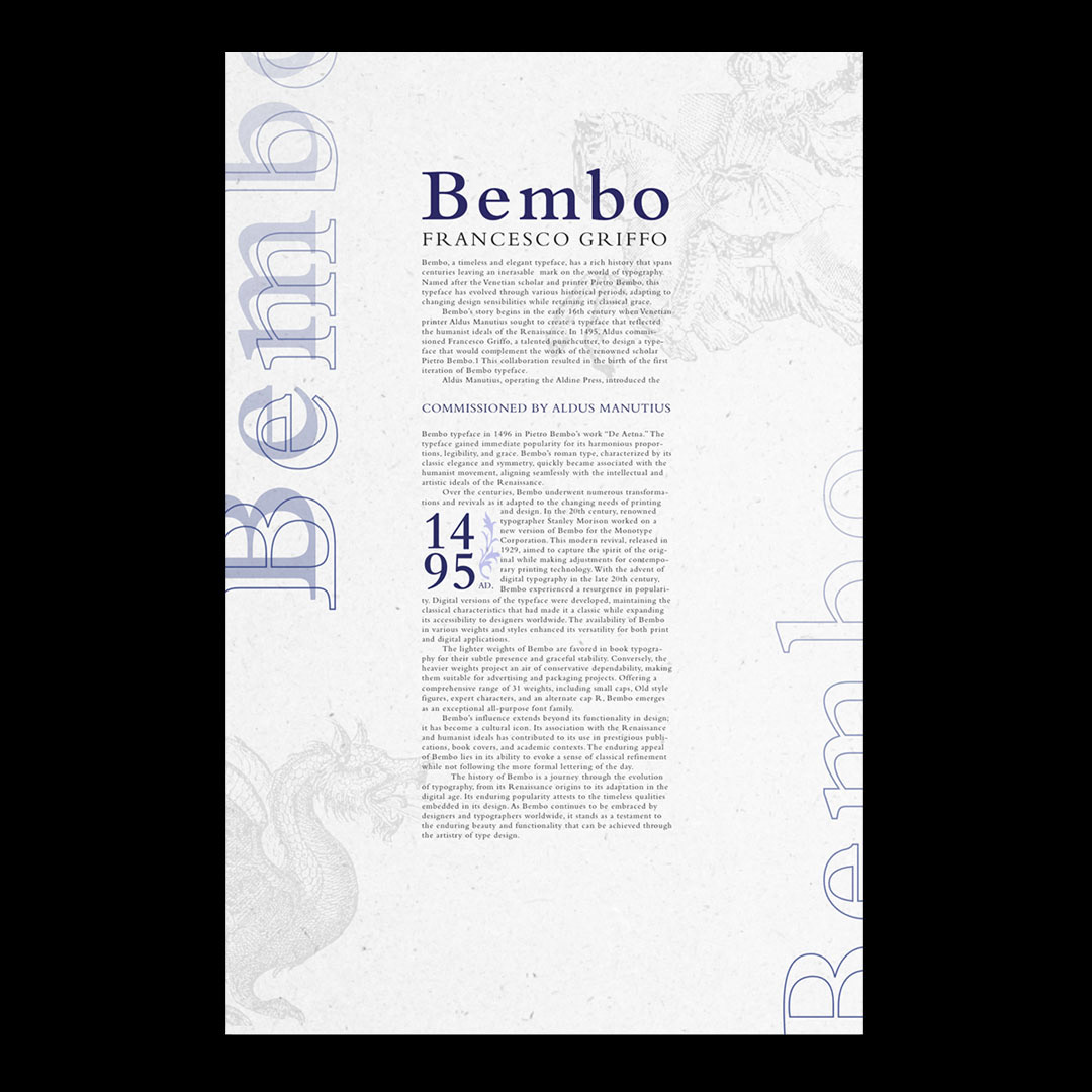
Considering Bembo's historical usage I wanted to give the poster a paper texture look to reinforce the old age idea. I also incorporated medieval style art icons to further place the viewer in that time frame.
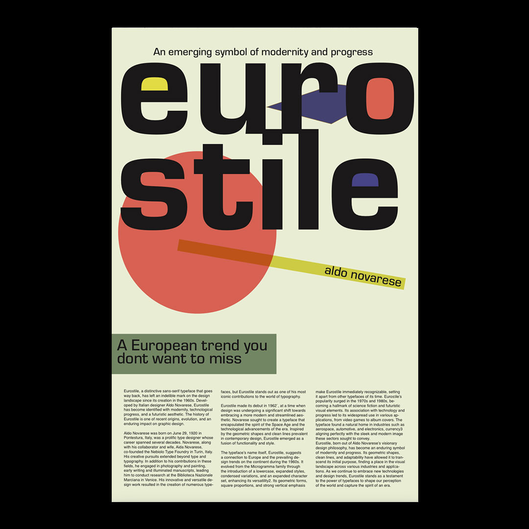
Eurostyle was popular during the 1970s and 1980s, which is why I incorporated the use of primary colors and abstract shapes. The use of layout and font placement is meant to give the posters a more vintage feel.